
A guest post by Priya Arora.
Your contact page is your introduction. If it is powerful enough, you are sure to grab attention. If it is not, then capturing targeted traffic will be challenging.
If you do not have a well-conceived, easy-to-navigate contact page, you will lose traffic and revenue. And if you do not have one at all, well, having no contact page on your website is like having a business card without a phone number.
If your site does not have a contact page, then how will your visitors and business prospects contact you? Remember, when you are operating a business online, there is no need to keep the route to reaching you secret or private.
If you are a blogger, a website owner or operating an eCommerce site you must have a contact page.
Why you should have a Contact Page?
- Gives your website credibility.
- Provides an official way for your customer to contact you.
- Presents legitimate opportunities to other bloggers to invite you to attend blogging events.
- Offers a way for casual users to contact you — users who might become leads.
- Makes the site look more professional and user-friendly.
There are myriads of blogging sites that have high-end blogs but are lost in the expanse of the internet for the lack of appropriate contact pages. Website developers and business owners have no way to get in touch. So if you are a blogger and want to make some money online, don’t forget to integrate a contact page into your site. Otherwise, you are sure to lose out on your prospects.
Besides, sites devoid of a user-friendly contact page are seen as unprofessional and unreliable by potential clients.
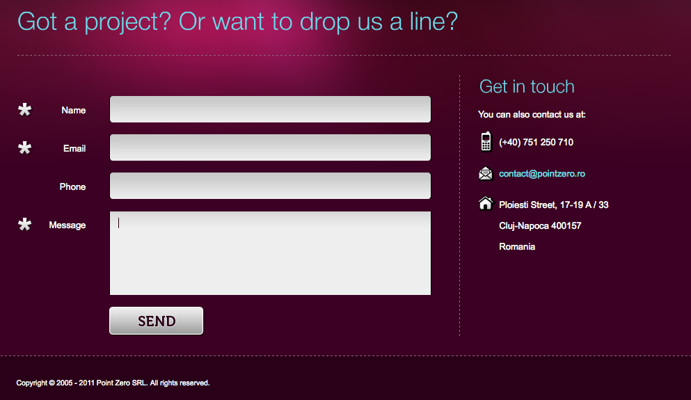
You must have a contact page on your website that has an email address, your phone number (if you are a business), a street address (if you have a physical location), your mission statement (if you have one), contact directions and expectations for replies, as well as social media sites you belong to.
Useful Information
It is always best to include quality information on your contact page. If your contact page is usable, it is less likely that your potential customers will become annoyed or frustrated. You may find it best to use HTML instead of images, which might be slower to load. You should integrate maps and a phone number if applicable. You may seek to integrate a Google map to optimize your contact page.
Optimizing a contact page is tricky and requires testing. You need to be astute and alert while you are building one.
Below are a few examples of optimized contact pages:
Today it is common for website designers and developers to integrate maps in the site only to point to the location of the brick and mortar shop. WELIKESMALL also does this, but with some difference. They provide a view from above of the site. They are highly creative in their approach and display all the relevant contact information in proper order.
The approach on the Bert Timmermans website is extremely simple. It optimizes presentation of all the information for simplicity and assembles it in one place, incorporating discreet design. All the contact modes are well integrated involving the social media leads.
Often, it is not necessary to integrate all contact information on your contact page. Noe Araujo takes initiative in preparing an appealing and user-friendly, content-light contact page.
Denise Chandler uses an easy to understand contact form, decorating it beautifully, offering an easy way to contact the blogger while also asking for useful information that this freelancer might need.
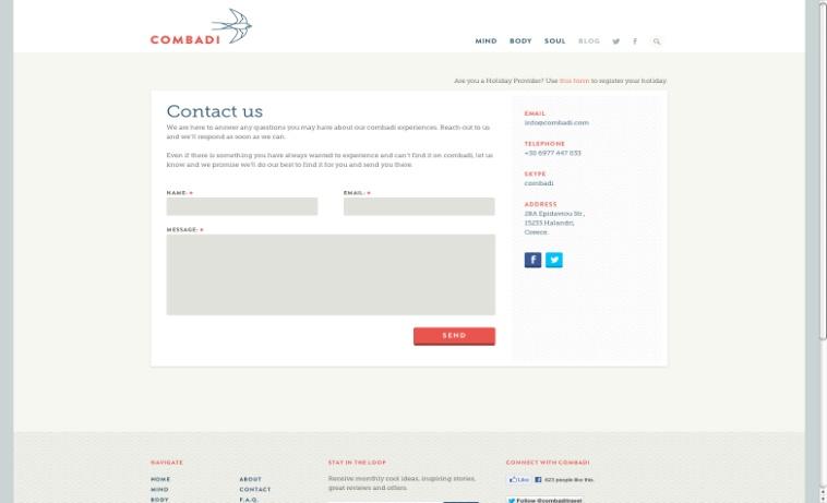
It is highly important to ensure that the brand is consistent throughout the site. Combadi gives special attention to the composition of the contact page. It appears more like a contact form with zing.
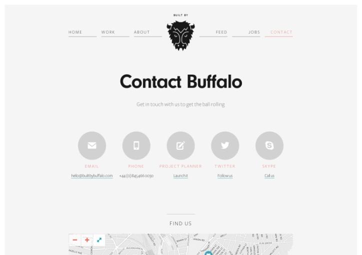
The approach taken by BUILT BY BUFFALO is quite simple and information-heavy without being cumbersome. They do not make a fuss about their contact page, so they have a bare contact document outfitted with varying facets.
Offering service more like a boutique, HELLO CREATIVE represents their brand using a highly creative, detailed and crisp approach. Their focus is on creating a relationship first instead of selling a product right away. This group is quality-oriented from their contact page to the art they sell.
FIOR DI LATTE is different. Their approach is simple, urbane and innovative. They concentrate on Twitter and Facebook followers just as equally as they focus on website visitors. Fior di Latte makes use of their contact page as part of their social media strategy. It is imperative for them that you value their online presence before you contact them, and they succeed.
So, now you can see how creating a contact page opens up opportunities for both sales and brand identity. Make sure your website has a great contact page so you can let the world reach out to you like never before.
What particular elements do you want for your contact page to have? If you also know of other awesome examples of contact pages, share them with us.
Author Bio
 Priya Arora is a grad Student focusing on Web Content Management.She is a Founder of @LobCityBlues. Priya is a tech geek, bookworm, freelance writer and total Queerdo. For more information, check out her webpage or follow her on Twitter!