In this day and age, a website is essentially an ad for your business that runs 24/7. Naturally, you want it to look as professional and as polished as you can make it. You want all its elements to be perfect. After all, a website represents your business, and its looks and functionality reflect how serious you are about it.
Don’t let your business struggle due to your website design!
Here are some of the bad web design elements to look out for.
Lack of visual appeal

Some people judge a website by its cover. If they don’t like the color scheme, fonts, layout or its overall look, they would simply close your page and move on to the next site. You could have the most amazing content, but your visual appeal, or lack thereof, can determine whether people stick around long enough to read it.
A site that looked state of the art ten years ago would look stuffy and outdated today. Be sure to update your site regularly, not just for the sake of functionality, but to keep up with the times.
Cluttered look
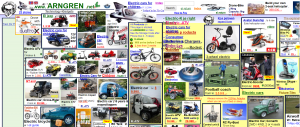
 Many web visitors quickly get turned off by pages that look cluttered. No one likes shuffling through content that is unorganized or inconsistent. It’s not easy to click through links and buttons that aren’t spaced-out well. Without the proper use of white space, the content can appear squeezed together.
In a bid to do a lot of everything, some web designers also make the mistake of having too many things going on at once, like a pop-up here and some animations there. Keep things simple and clean to avoid overwhelming users or they may turn to other sites.
Navigation issues
Appearance means a lot on the Internet, but it’s not everything. You can have a gorgeous-looking website, but it won’t mean anything if navigating it takes a lot of hard work. The navigation of any website worth exploring should always be straightforward and intuitive.
To make things easy for your users avoid having more than one navigation bar and limit the number of clicks needed to find your content. If you make it confusing or time-consuming for visitors to look around your site, they will quickly become frustrated.
Make your site easy to use with these top 10 user experience tips
Slow loading time
 One thing about Internet users today is that most, if not all of us have increasingly shorter attention spans. We always seem to be in a hurry, and we can’t tolerate pages that take forever to load. Ideally, your page should load in less than 2-3 seconds. If it takes longer than 5 seconds for the whole page to display properly, you can assume that many of your users will click the back button before they even see the site.
There are several design factors that could contribute to why your website is loading slowly. Your site may have too many plugins, excessive code, or extra large images. It’s better to take the time to fix any issues that are causing a slow load time than to lose your website visitors because of it.
Automated music or sound
 Music or sounds that automatically play when accessing websites are a pet peeve of many Internet users. People want to be in control of what is coming out of their speakers, not surprised by it. Far too many of us have had near-heart attacks with the unexpected onset of automatic audio, especially those who regularly wear headphones while surfing the net. Instead, use a click to play option so that those who want to hear the lovely sounds you have to offer can do so when they choose.
Using stock images
Stock images are typically shot well and include attractive people flashing white toothed smiles. While good looking photos may enhance your web design, many of them look cheesy or inauthentic. If you need to use stock images, choose your photos carefully to be sure that they are accurately representing your company rather than just filling in space.
Better yet, ditch the stock images, pull out your camera or hire a real photographer and take pictures of your actual team and products. Visitors will like the authenticity of it all and will be more likely to trust you enough to buy whatever you’re selling.
Non-mobile responsive
 In this day and age when the number of mobile users has surpassed those who use desktop computers, a web design that’s not mobile-responsive is considered poor web design. Trying to zoom into a full-sized website on a phone or tablet can be a real headache and many users will abandon ship as soon as they see the miniature sized text. Be sure to cater to both desktop and mobile users so that your users have a pleasant experience no matter what device they use.
Web design can influence people’s opinions about the credibility of a business.
These are just some of the design elements that can hurt your online business. If you know web design, you may be able to keep things looking sharp on your own.
Get the inside scoop on the top 10 free web design tools
If you don’t know web design, it’s best to leave it to the pros. Set aside a budget to hire a good web designer to help you improve your online business outcomes. Your website, after all, is the face of your business on the Internet, and it needs to be at its best at all times.
 Andrea Ladera is a content writer at My Biz Niche, a Phoenix based digital marketing firm. When not helping websites get to Page 1 of the SERPs, Andrea (she also answers to Andy) enjoys walks around the block with her Yorkie and practicing yoga.


