So you may have seen in our last post that recently we moved from Toggl over to Harvest in the last few weeks. Years ago, we used to be on Harvest as well, but moved off for various reasons. Over the years, we’ve gone back and forth on a lot of this. We’ve used a lot of different tools. So in this video, we take you through the aspects that we like and don’t like about both systems.
Disclaimer: We’re Not Getting Paid
We are not getting paid for any of this, and are not affiliate marketers for Harvest or Toggl. This is my honest opinion of both systems, how they stand, and what’s good and what’s bad.
Pricing in Toggl vs. Harvest
Toggle Pricing
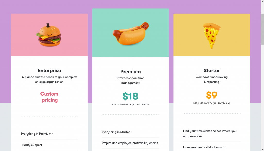
Toggl has three plans, which are really two plans since most people are just purchasing the Premium and Starter plans. There are also monthly and annual options. They start at $10/mo, and have a premium plan at $20/mo. If you pay for it by the year, it comes down by a dollar for the starter plan and two dollars per month for the premium plan. The difference is in the automation and profitability charting.
Harvest Pricing
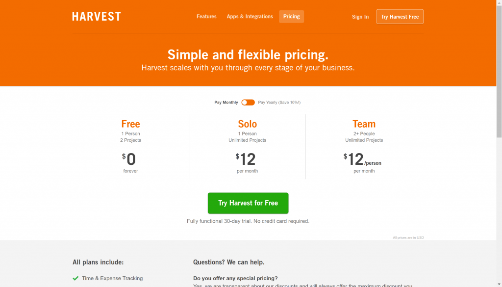
Harvest has a simpler pricing system with either a free plan or a $12/mo plan. There’s no $20/mo plan, but also no profit reporting. If you go for the annual plan, it takes it down by a $1.20/mo per person.
But there’s something hiding in the back
If you look a bit deeper, you’ll find that they don’t tell you everything on that public facing page, and this part is a little frustrating. When you go into your plan and try to upgrade it’s actually one person for $12/mo, 5 people for $49/mo, and the 10 people for $99. So if you have eight people, you’re still paying a hundred bucks a month.

Maybe grandfathered in?
We have more than 10 people, so it’s not such a big deal for us. But, I didn’t like that it was different here versus here. It could also be there’s a possibility that I had just signed up for this system so long ago, that I was grandfathered into some previous pricing system.
User Experience
User experience is one of the biggest things for me because if the team can’t easily understand and use the system, it’s not going to get used.
UX on Harvest Time Tracking
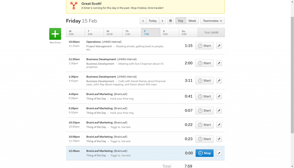
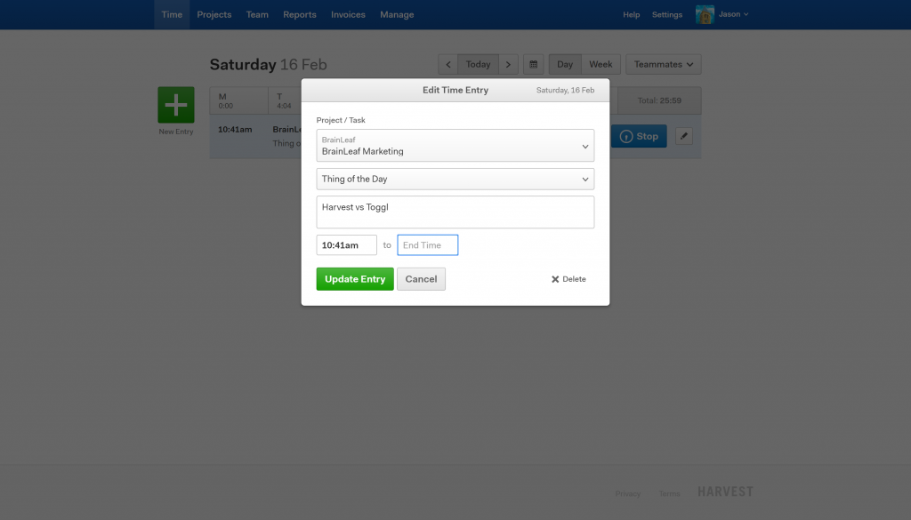
This was today, Friday the 15th. On this image, you can see that I was doing the BrainLeaf Marketing ‘thing of the day in Toggl versus Harvest’. I had been researching for about 22 minutes to get ready for this.
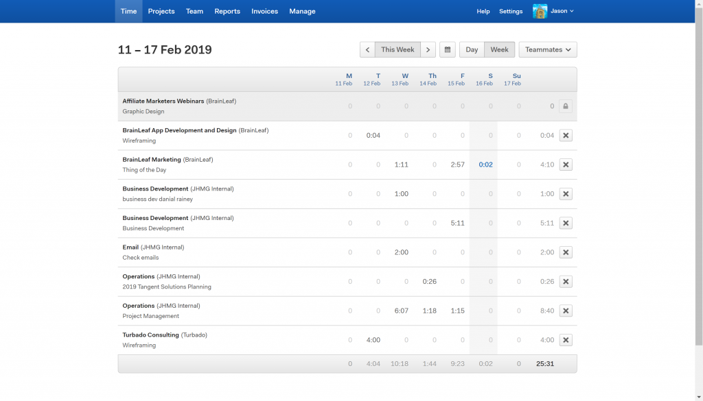
Some things I really like about the Harvest UX:
- As the manager here, I can come in really easy and switch to other people on my team.
- The ease of clicking stop, start, and editing
- Editing duration or start and stop time is easy.
- Clicking an entry starts another entry below it as a new task for just that new item.
- The days of the week are easy to navigate through.
- The ‘Week’ view allows me to see everything I did this week and edit numbers for the week.
- The ‘Week’ view is very, very helpful for entering contractors hours that they may not have entered themselves.
- The modal that opens when you click start or edit is very easy to use and well designed.
UX on Toggl Time Tracking
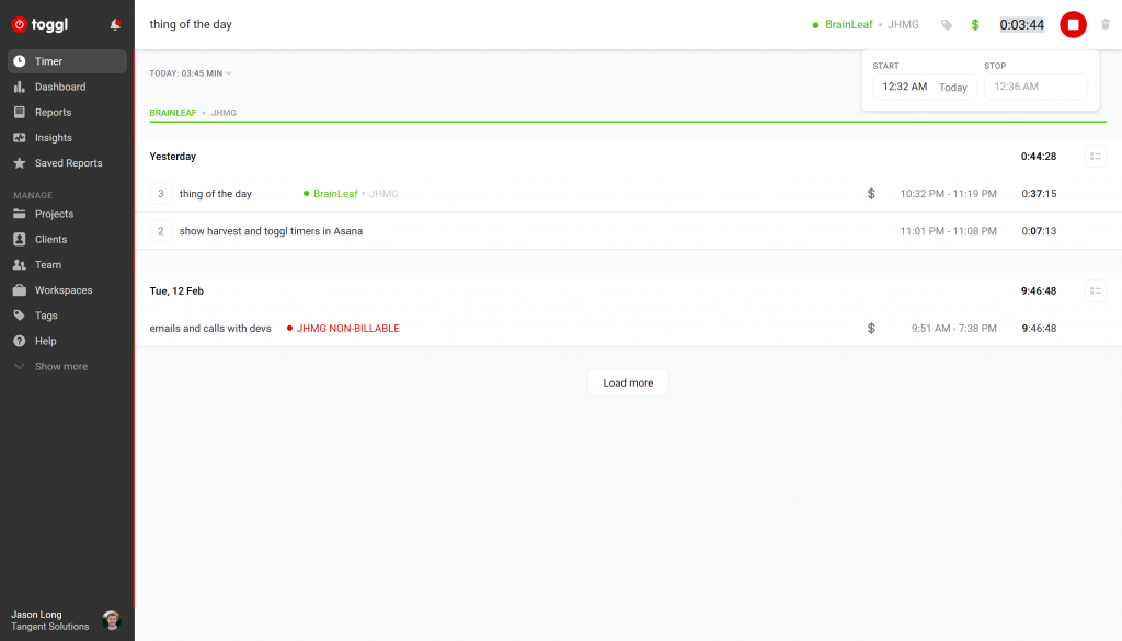
There is no week view for Toggl, only a Day view. However, you can scroll down to see previous days.
Things I liked about the Toggl UX:
- The pre-fill system is very nice and gives a lot of info as you are typing your clients and tasks.
- A lot of information shown in one place.
- The billable or not billable icon shows what items we are billing for.
- Color coding makes it easier to read quickly.
- The tagging system in Toggl is great. I prefer this over Harvest.
What I didn’t like about the Toggl UX:
- Editing time is difficult.
- The shortcuts for arrows vs tabbing is confusing.
- Editing the client, task and notes at the top of the page can get frustrating.
- The delete function enables a delete and then there is an undo, not an ‘are you sure’ message before hand.
And the UX winner is…

Both systems are good, but Harvest was a clear winner on the UX. With the teammates views, week view, easy to edit, and overall cleanliness it is easier to use and more fully featured than Toggl. Toggl also has a few UX issues that are still holding it back.
Integrations with Harvest and Toggl

My team relies heavily on both Asana and JIRA for project management, so I am going to show you how these two systems are integrated into Harvest and Toggl. Once again, the differences come down to UX.
Harvest + Asana
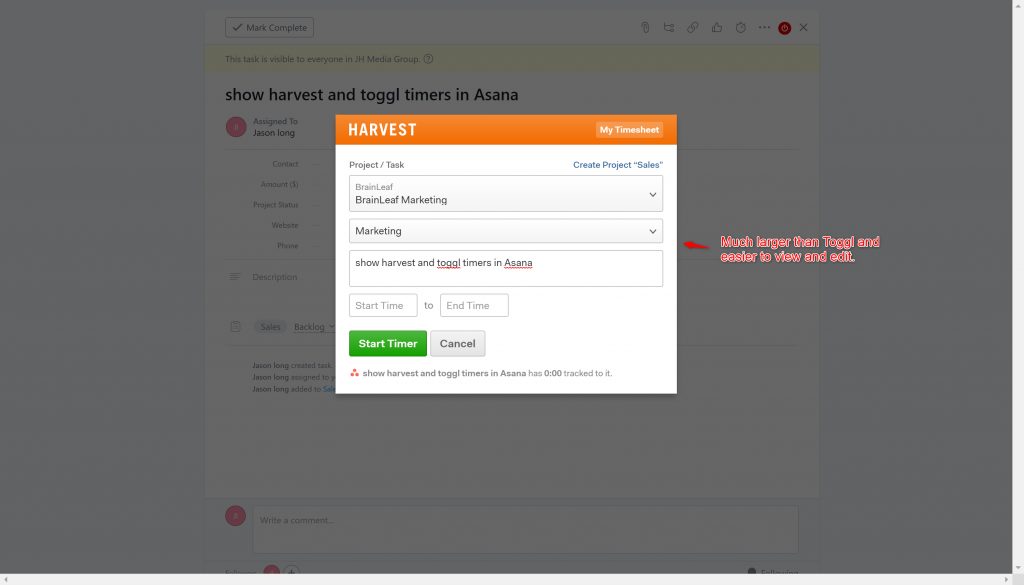
- Easy to use because it is large and I can read and edit text.
- Loads a little slowly, but just a second slower than Toggl
- Has some issues loading the right project sometimes. But this may be because I don’t have it set up correctly.
Toggl + Asana
- Quick to pull up
- Easy to understand
- Small and impossible to see a full note
- When opening a dropdown, you have to click on the ‘x’ to close that area. The ‘x’ is small, so that makes it harder to use.
- I like the ‘Billable’ option. This helps people think about whether an item is billable or not.

What I don’t like about both systems: When I start a timer, most of the time they don’t connect to the right project. This could be because I didn’t set it up correctly, but it is still annoying.
Asana Integration Winner:

Both systems do the same thing, but Harvest has better usability.
JIRA + Toggl or Harvest: There is a problem.
For both Toggl and Harvest, the biggest problem is that it doesn’t log the time back into the time tracking in JIRA.
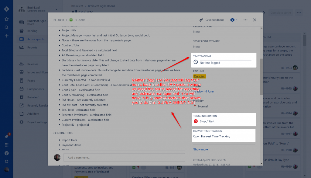
You have to go into the Atlassian marketplace and buy another system not built by either Toggl or Harvest to take the times that you logged through your time tracking system, and then load them back into Jira.
You need this for things like velocity tracking and burn down charts, and just general time tracking to make sure you’re making estimates in Jira. Ensuring your estimates are correct is critically important if you want to say profitable and not upset clients, so it is really annoying that neither Toggl nor Harvest have that feature built into their tools.
Third-Party Systems Costs
In Harvest there’s a tool that is $5/mo month + then 95 cents per person per month. The tool for Toggl is $5/person per month. That is a big dollar difference between these two systems, so the winner goes to Harvest. But in my opinion, both systems should have considered this given the massive usage of JIRA.
Reporting in Harvest vs. Toggl
Profitability Reporting
Both systems do a great job of showing reports. The big advantage that Toggl has over Harvest is the ‘Insights’ system that is currently in Beta. That system is going to double your cost but will show you what you really want to see profitability. This is probably the biggest drawback of both systems. Running a company, what I really need to see is how profitable or unprofitable a project or person is, so this is a big missing piece of both systems. Harvest has an integration with ‘Price & Cost’, but this system is expensive. For what we need the system to do, it would cost us almost $300/mo. In Toggl, my cost is going to be doubled from $10/mo to $20/mo to see profitability. So instead of either of these, we just export our information using Zapier out to Google Sheets and run reports from there.
What Harvest does well
What Harvest does really well is to show all the tasks, all the people, all the projects in one place. We can see all the clients and projects very easily.
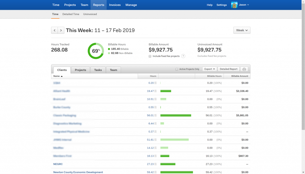
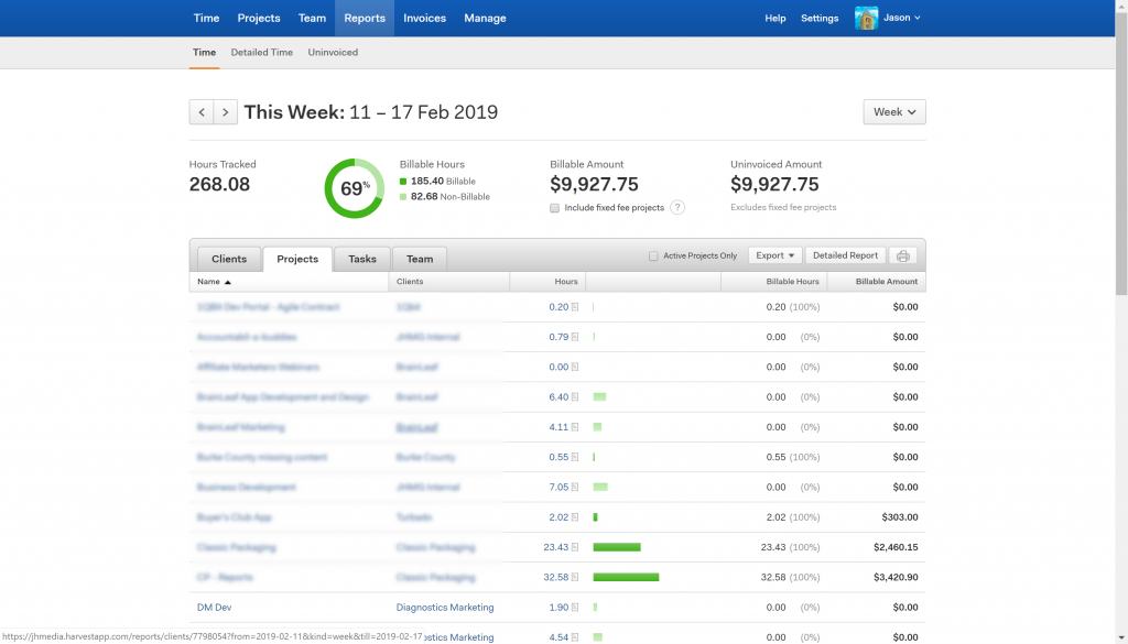
We can see how everything is going in here, the bill amount, the billable hours, the dark green is billable time, the light green is un-billable time. From a team management perspective, so I can see my team, how many hours they’ve worked, and how many of those hours are billable.
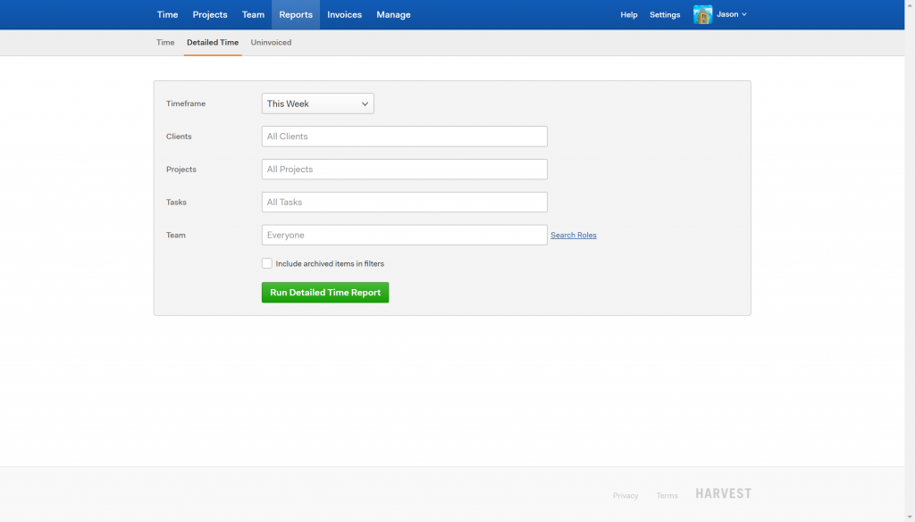
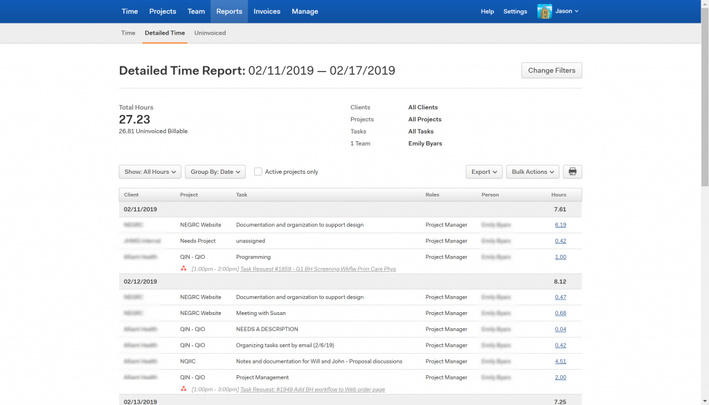
The detailed reports enable me to really clearly see review individual people and their performance.
What Toggl Does Well
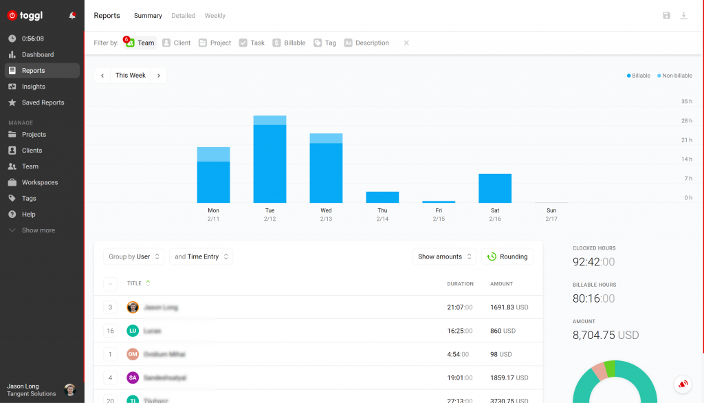
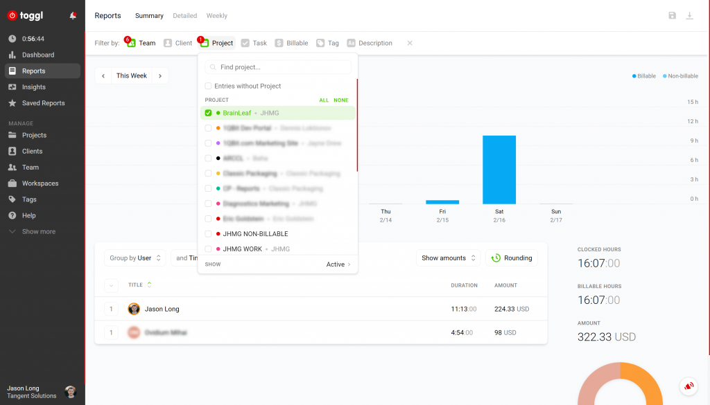
On the reports dashboard in Toggl, I get basically the same information as in Harvest plus some additional little bits of information. One additional item is a bubble graph of your prople, which is nice but a bit superfluous.
Reporting Wrap: Harvest by just a hair.
Overall, this system very helpful, it shows me my day by day, the summary, the detailed, and the weekly views in the same way that Harvest. We still have all the people, but I really like the visual aspects of the bar graph in Harvest beside each person. However, I think that Toggl does a better job if the quick filtering as well as the color coding.
A Harvest Annoyance
One downfall of Harvest, is when you’re exporting through Zapier, to like Google Sheets, there a problem. The way the system is built, you can’t export the person’s name. You can only export their ID, and that is really, really annoying. In order to do profitability reporting in Google Sheets, you have to do a whole bunch of fancy Google Sheets formulas to be able to run your reports. Toggl is about the same, but I feel like both systems should have taken this into consideration.
Quickbooks + Harvest Invoices: The Killer Integration
The Harvest invoicing tool paired with the Quickbooks integration was probably our main reason for going back to Quickbooks.
The reason for this is that I can have project managers sending all of their own invoices without having to go into Quickbooks. That is critical because this way I know that they’re watching the contractors, I know that they’re watching their projects, they’re watching the money, and sending out their own invoices saves a ton of time for our billing department. That’s is a half to a full-time job for someone, depending upon the week, just sending and collecting of invoices. If PM’s can send and manage their own invoices, then I have another half to full time person available to me!
And The Winner Is…
Harvest is just a more mature tool than Toggl is. Toggl is still a great tool, definitely worth looking at. In the end, it came down to better user experience in Harvest, and the fact that we get the invoices and easy QuickBooks integrations in there.
So for this particular little battle, the winner goes to Harvest, in my opinion. Like I said, Toggl still a great tool. But, for us, for what we’re looking for, Harvest was the clear winner.

There we go. I hope this was helpful for you. Have a great day!

Jason Long is the founder and CEO of BrainLeaf. A self-professed serial entrepreneur, he is always interested in new businesses, new ideas, and new ways to change the world. He has over 17 years of experience in design and development, he has served in a variety of different roles ranging from designer to CEO. He spends most of his time focusing on the build and development of new ventures while trying to travel the world.


