A solid call to action (CTA) is a vital part of funneling visitors and boosting overall revenue for your business.
If you personalize your CTAs based on past buying experience, or the habits a visitor has while browsing on your site, you can increase your overall conversion rate by about 42%.
The possibilities are endless, but in the end, the best CTA button is the one that converts visitors. It could be to get them to purchase something or to funnel them toward signing up for your mailing list. What that conversion looks like will depend on your business goals.
If the overall goal is to boost revenue, you can learn a lot by studying effective examples of CTAs. Looking at what other websites are doing, and try out those same tactics. Pick the ones that make the most sense for your website.
It’s smart to do your own split testing to make sure the button is equally effective for your audience. Though it’s important to know the rules and what works for others, don’t be afraid of stepping out of the box and trying something new.
Try Out Less Wordy CTAs
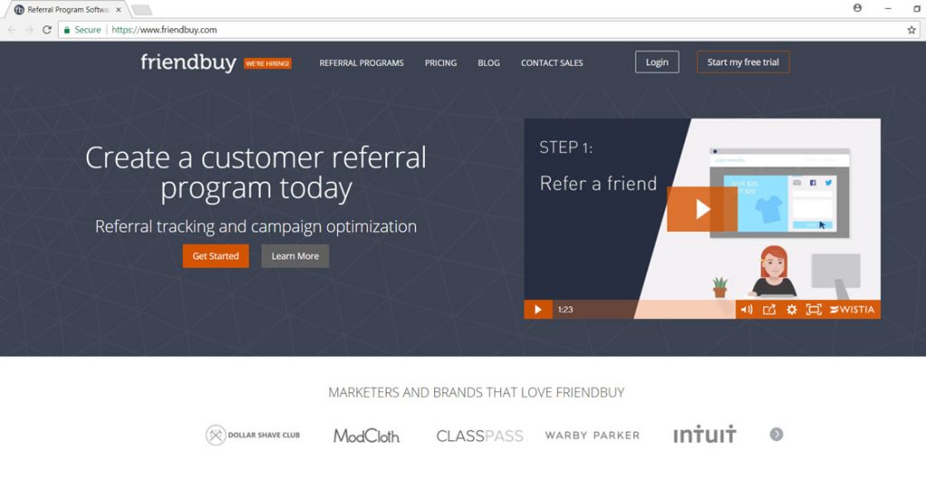
Friendbuy took a look at their CTA for their online demo of their product. The site offers widgets that help bring in referrals and new customers. Their goal with this particular CTA button was to get people to try out their demo so they’d want to use their product.
They tried a couple of different scenarios to see which worked best. Originally, their CTA read “Wanna see it? Share Friendbuy with friends!” Their first variation was a smaller button that read, “Test it out.” The second variation read, “See demo.” All of these include social share buttons.
The result was that site visitors preferred the less wordy button that simply read “See demo.” When Friendbuy tested the two versions, they found that the click-through rate went up 211%.
More recently, they have changed the text on their button again (see image) and lost the social share buttons. One can only assume they split tested this model and found it even more effective with their audience. It now reads, “Show me what’s inside.”
Include Action Words in your CTAs
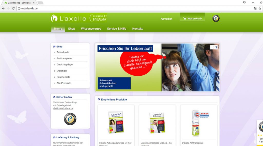
L’Axelle also conducted some A/B testing on their call to actions and found that writing action-oriented copy increased conversions by a whopping 93%. The goal was to get more people to click on the “add to cart” button.
The original CTA read, “Feel fresh without sweat marks.” They changed this to an action instead, and adjusted the copy to read, “Put an end to sweat marks!” Notice that not only did they change to an action word, but they also added an exclamation point at the end to stress the importance.
The current site uses some differently worded CTAs, such as “Brush up on your life!” Note that they still use action words to retain that success rate, though the wording has changed.
Discounts
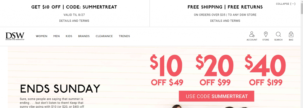
DSW utilizes a call to action by putting a discount code front and center. This is the first thing that a site visitor sees, and it can funnel visitors directly to where you want them to go and increase conversions.
Take a look at what they’ve done for their CTA. Not only is it offset in red, which naturally draws the eye, but they also use a discount to encourage the site visitor to click.
Offering discounts is an excellent way to entice visitors to go ahead and order. This type of offer results in high conversion rates. After all, everyone likes a good deal.
CTAs Eye-Catching Colors
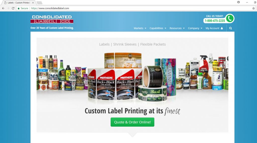
Consolidated Label initially started out with no call to action button at all, but after adding one, found an increase of 62% in conversions. Their goal was simply to get people to request a quote. Of course, not everyone who requests a quote will become a customer, but this type of goal accomplishes a couple of things.
First, it allows the company to reach out to customers more than once and offer specials and try to gain their business. Second, it also gets the customer to take action. While not everyone will order, orders will surely increase with a successful CTA.
In the example posted below, notice how they used a vivid button color that’s bright against the white background. The button draws the site visitor’s eye.
Laser-Like Focus
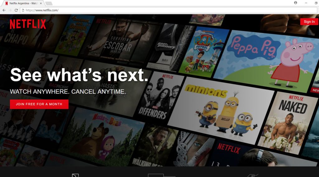
Netflix is pretty brilliant with their use of CTAs on their landing page. Not only does the color red stand out and create a sense of urgency and energy, but the site also uses action words to draw your attention. The word “free” and the length of time are both clearly stated, providing a sense of trust for the site visitor.
Some people might still be reluctant to sign up because they fear they can’t easily cancel a subscription that’s charged every month. However, Netflix addresses that fear by stating above the CTA button that the subscriber can “Cancel anytime.”
The color ties into the overall Netflix logo and theme. Even though red is a great choice because it draws attention, if it clashes with your overall design, it might be better to choose another color.
Finally, because there are only a few things on the page, the attention is very focused. This helps draw attention to the CTA.
The Fine Print
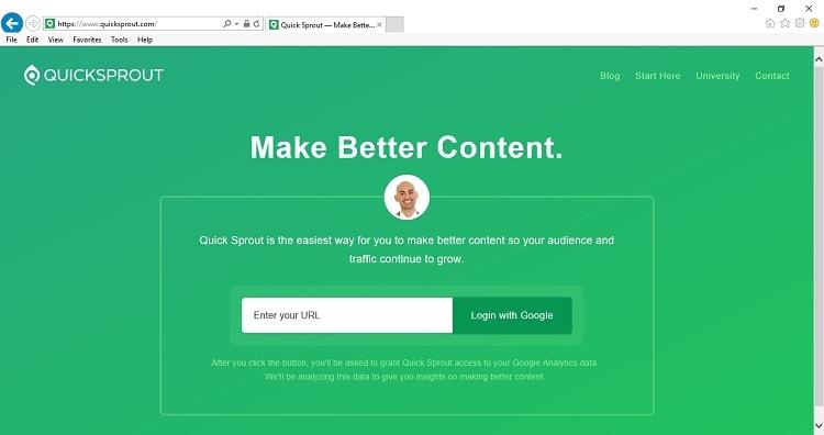
Okay, so the design on this page is not great. All the green kind of makes one’s eyes hurt. However, the concept of the CTA on this page is brilliant. The attention is definitely drawn to the one text box area.
Quick Sprout states their purpose clearly, which is to help you “Make better content.” Simple, to-the-point, with no frills, bells or whistles. Then, you have the “Enter your URL” command and a “Login with Google” button.
What’s kind of interesting about this CTA is that, under the box itself, is some detailed text that’s not easy to read but puts some of the visitor’s fears to rest. It reads, “After you click the button you’ll be asked to grant Quick Sprout access to your Google Analytics data.” The text goes on to explain what they’ll do with this data and how it will help you.
CTAs: What not to do
Don’t try to force your visitors to sign up for something. Have you ever visited a website that tried to force you to share your email in order to shop? You probably exited out of that site, never to return. Yes, you can entice them. However, forcing them is truly not appreciated.
Don’t threaten your site visitors or try to scare them. If your product or service truly has value, then your CTA should be simple. There is no need to post something like, “Save your life, click here!” Visitors won’t appreciate this, either.
Take the time to look at your CTAs through the eyes of a new site visitor. What impresses you? What would entice you to click on the button? Is there anything grating or annoying about your website and your CTAs?
Get some additional feedback from third parties. You can either ask family and friends to give you some feedback or turn to a design professional to get ideas for how to better utilize your CTAs.
Once you have the design perfected, you really aren’t done, though. You should retest your CTA wording, position and even color from time to time. Conduct some simple A/B testing to see what works best with your site visitors and make adjustment as needed over time. The goal is to get the most conversions you can, and the only way to do that is to try out different CTAs until you find the ones that speak to your target demographic.
Feel like you are missing out on potential customers? We’ve got the fix!
Easiest Ways to Convert Visitors Into Customers
 Lexie Lu is a designer and writer. She constantly researches trends in the web and graphic design industry. She writes weekly on Design Roast and can be followed on Twitter @lexieludesigner.


