From our guest author Rajneesh Kumar!
What’s actually missing from your landing page
We’ve all heard “don’t judge a book by its cover” and most agree it’s a good mental framework to live by. You and I both know, however, this rule typically gets thrown out the window in the marketing world where consumers have been numbed by years and years of market and sales tactics. On the Internet, a landing page is the book cover that holds the key to the success of a website. It doesn’t matter how great your product or service is; if your landing page doesn’t make the right first impression on visitors, all your efforts are in vain.
Landing pages are not just about design
Designing a perfect landing page is no easy task as it requires insights into buyer psychology along with design knowhow. Besides neat layout & impactful text, we also need to work with colors, images, icons, etc. to stimulate visitors’ emotions and make them want to dig deeper.
Ultimately, some key elements decide the conversion potential of your landing page, and unless you look at it from a conversion standpoint you can’t actually know what’s missing from your landing page. So, let’s talk about those crucial elements, their role, and how to use them to make our landing pages more impactful.
Clear & Catchy Headlines to Grab Attention
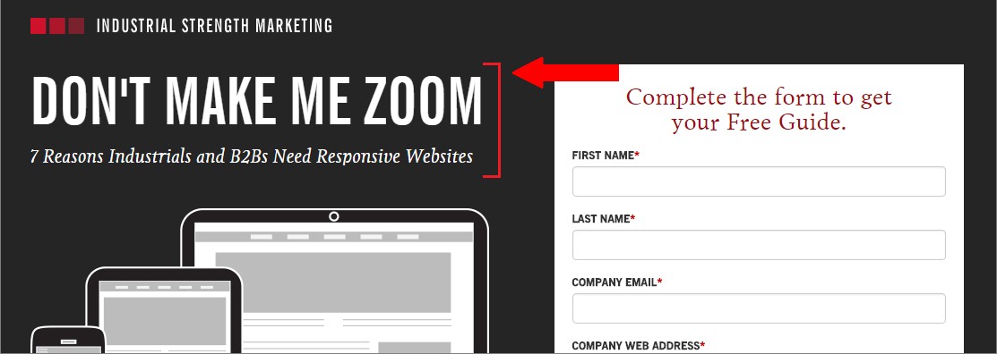
Headlines are one of the first things that visitors come across on a webpage. Thus, it is important that our landing page headlines perfectly complement the ad copy message that has brought the visitor to our website in the first place. It should also talk about the exact need of the visitors and must be captivating.
Landing page headline of Industrial Strength Marketing (a web design company) serve as a good example here:
Direction Cues & Color Tricks to Guide Visitors
Did you know direction cues can literally make visitors do what we want them to do once they are on our website? It’s likely the registration form or some sort of CTA that is the goal, and using direction cues like this can do the magic for us.
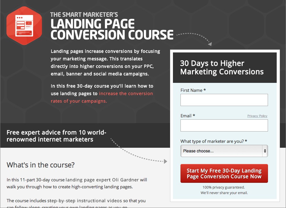
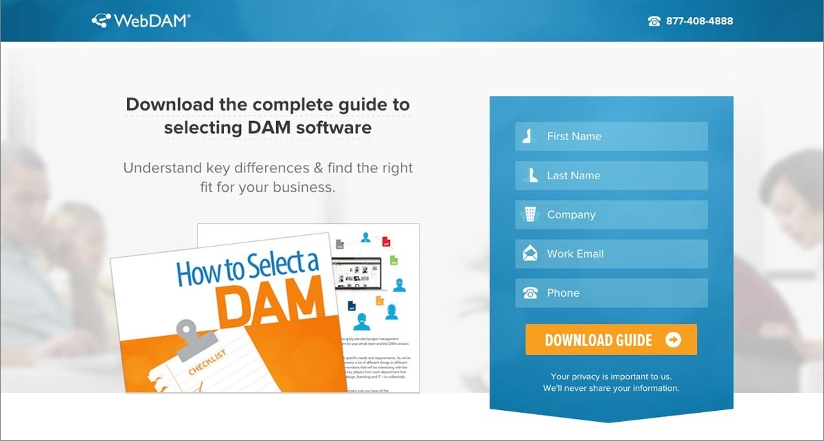
Another way to guide visitors towards a certain element is to enhance its visibility by using the right color combination, like webDAM did for its registration form:
Supporting Elements to Cement the Claims
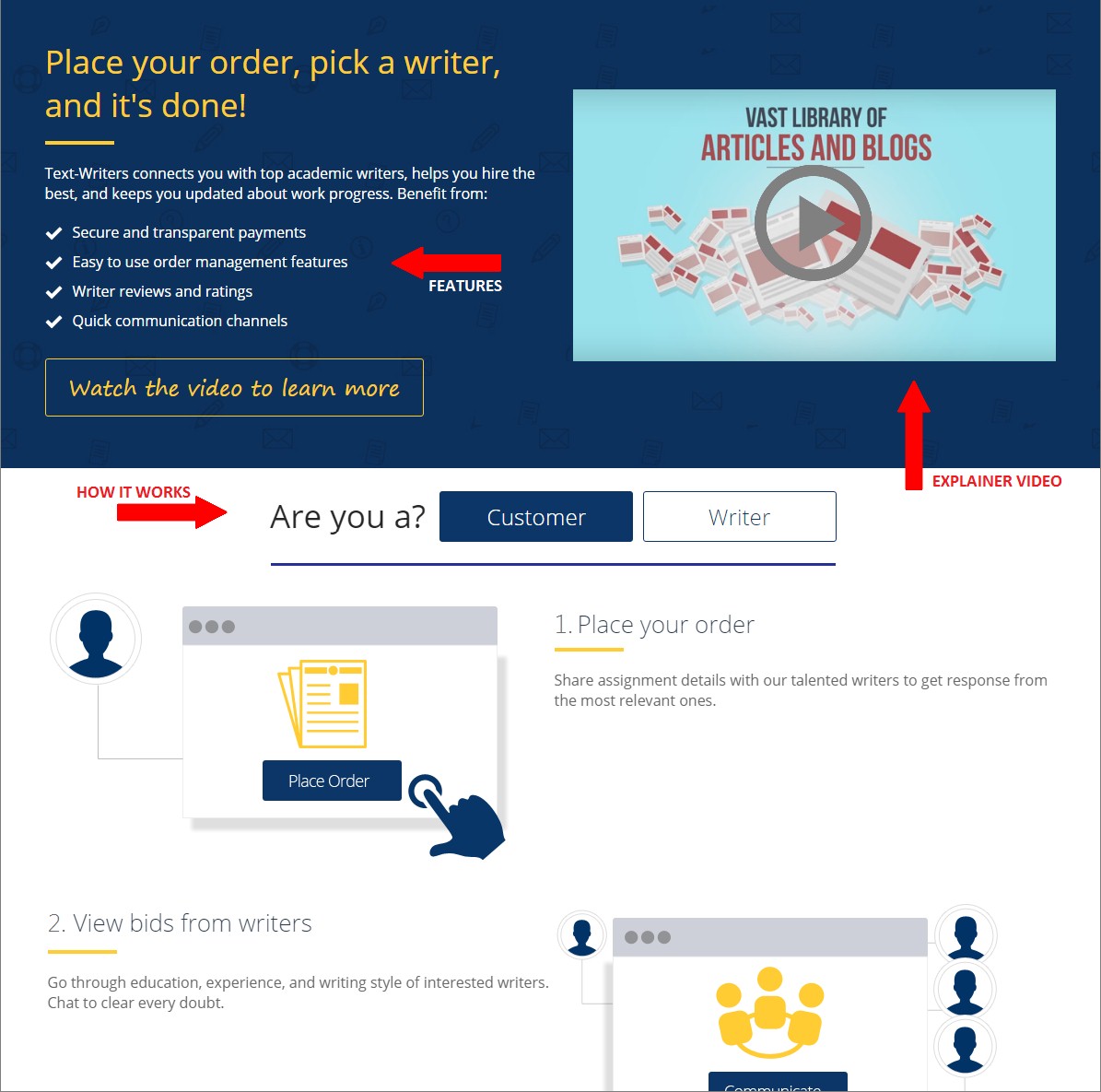
A catchy headline is necessary but not sufficient; therefore, we also need to provide information to visitors. Based on the offering type, these supporting elements can be benefits or features of a product, video, or other infographics on how it works. To take some ideas, let’s refer to Text-Writers’ landing page which has included all these supporting elements in a well executed manner.
Social Proof to Gain Trust
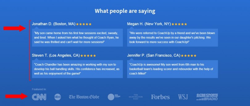
Now that we have a catchy headline, direction cues to registration form, and information about our product we’re done right? Not exactly. How do we know if visitors trust that what we say is true? To ensure that, we’ll need to include some social proofs. It could be client testimonials, stats, clientele, media where offerings are featured, etc.
See how CoachUp has highlighted testimonials & online mentions to earn the trust of visitors.
Inescapable CTAs to Seal the Deal
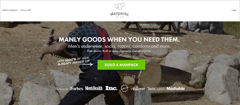
Depending on the page length & flow, there can be one or more CTAs. To create an effective CTA, we must brainstorm over its placement, text body, design & purpose. Instead of using boring text like ‘sign-up’, more actionable text for the CTA button is used. Just like Manpacks:
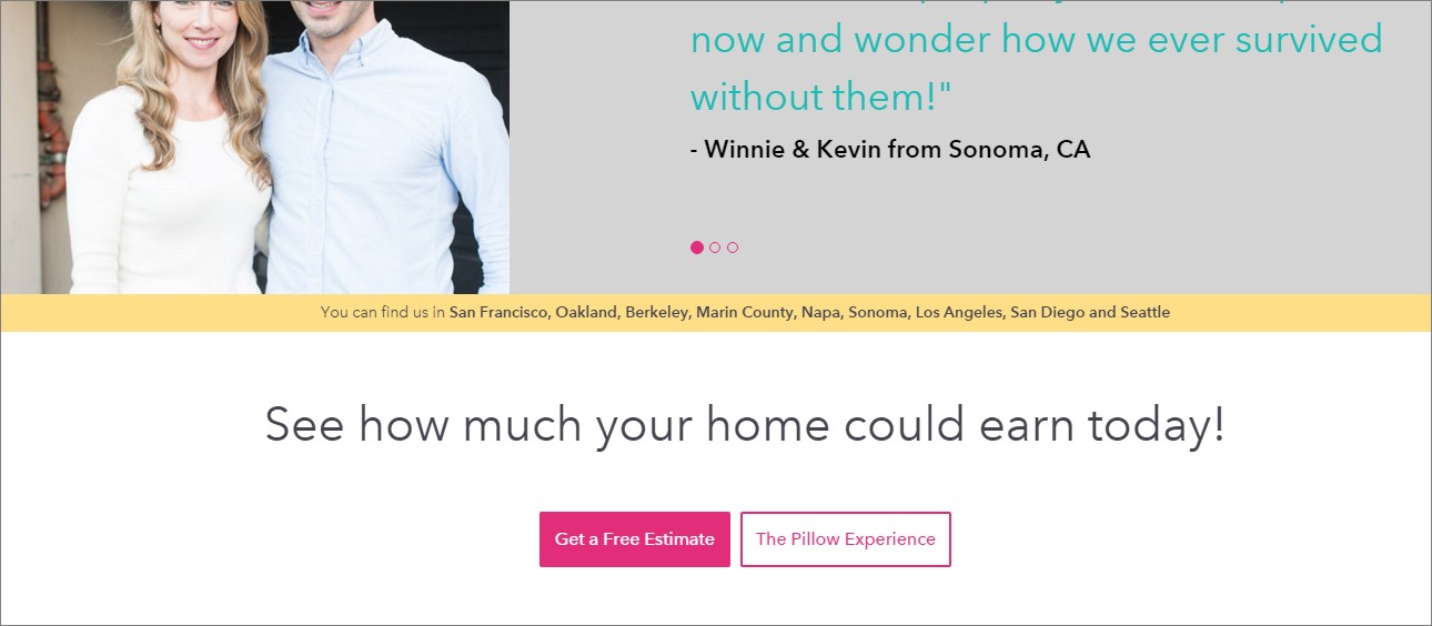
Also, we need to make sure content & tone of the CTA message is in accordance of its placement. If it falls at the bottom of the page, it should be concluding enough to wrap up the deal, like Pillow-Homes:
By and large, a landing page is all about:
- Capturing attention
- Providing relevant information
- Highlighting your offerings
- Proving your claims
- Allowing visitors to move further into your website.
The elements mentioned here are the most critical ones to achieve these feats. Design a landing page with the above points in mind and there is drastic improvement in a website’s performance.

Rajneesh Kumar has spent many years mastering the art of UX design and Information Architecture at FATbit Technologies, a leading web solutions brand. He helps global businesses and organizations connect with their audience by delivering intuitive site browsing experience. Rajneesh also shares his design thoughts on major blogs and discussion communities.
Follow me on Twitter: @Rajneesh_Max


