The WordPress Website Scope of Work Deep Dive.
Naturally, we’re going to be delving into how to assemble this within our system, and we’ve put a template together for you to get started with here. Using this template as our example, we’ll walk through the various steps of assembly and how everything fits together when creating a scope of work for a business website.
Bear in mind that this is our process, and you may find that some variations on this work better for you and your team. We also want to stress that there are elements of this that change with each website. This is meant to be a general overview for a standard business website – a good starting point, rather than a deep-dive of any particular industry website. So you’re going to need to rework this a bit for each site.
Lastly, this deep dive will be specifically focused on our exact process for how we approach the scope of work for WordPress websites. It may be helpful to first read through a more generalized, basic approach for building website project scopes to help you better understand scoping and the terminology involved.
How We Built Our WordPress Website Scope of Work
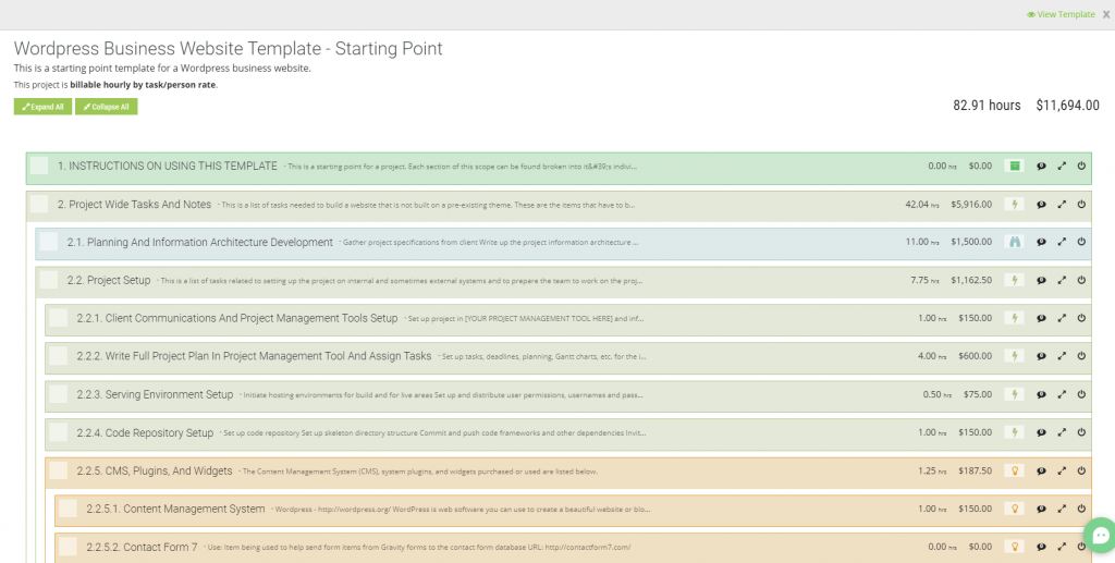
We have a specific template we use at JH Media, called “WordPress Business Website Template – Starting Point”. Note the “starting point” – there’s always more to do. Further, this is specifically for use with WordPress. If you prefer another platform, such as Drupal, Craft, Shopify, or other platforms or CMS’ then you’re going to need to consider a few small changes. However, this is still a good place to start for those as well.
Take a look at the YouTube video for the full walk-through!
Instructions Included
Within the template we included basic instructions on how to use this template to build your website scope of work:
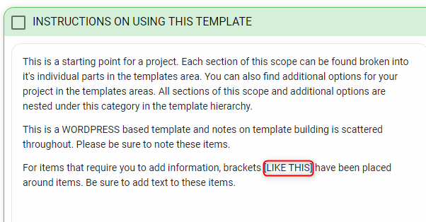
Note here that there are sections where we’ve added brackets (see the red box) that need to be changed out for items specific to your project.
Our Website Scope of Work Template Is Reusable
The first major section of the SOW template is labeled as “Project-Wide Tasks and Notes.” This area has notes and times for items including:
- Writing out the information architecture plan
- General project setup tasks
- Compiling the plugins and widgets you want to include in your CMS
- Concept design
- Project management
- SEO
- Content creation
- Your project launch checklist
- Mobile responsive improvements
- And so much more
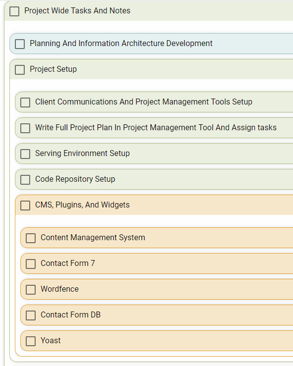
The next section is our information architecture, which is going to cover the following major areas and their subsections:
- Header and footer
- Home page
- Services page
- Work page
- Company page
- Contacts page
- Plus a few other basic formatting elements and pages that need to be present in a basic WordPress site
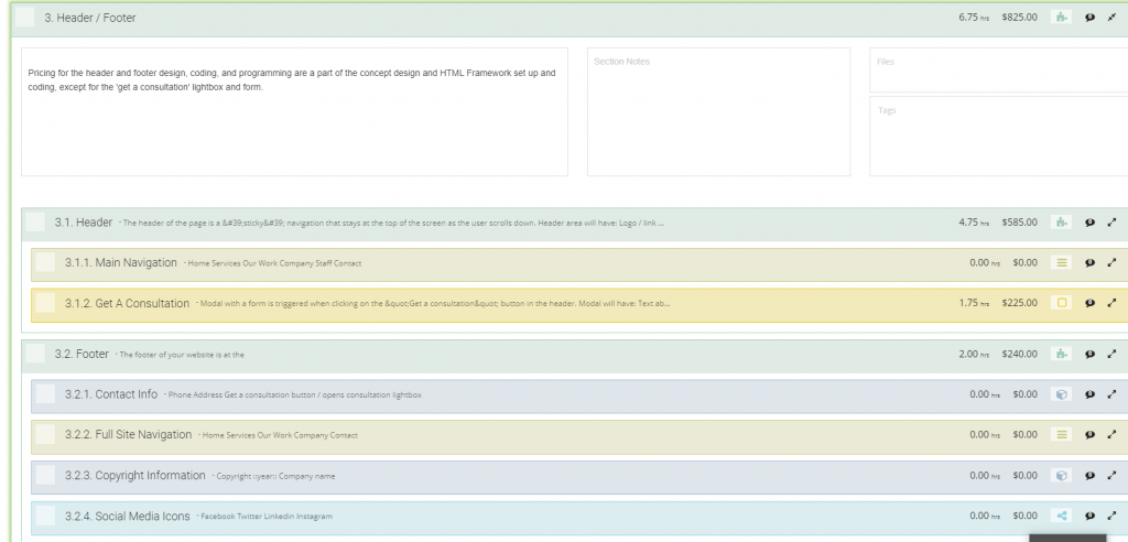
After loading up the project fully instead of looking at the template overview, we can enable Read Mode. This allows us to more easily see what elements are included in each item.
Must have items for building a business website
The reason we put together this project-wide tasks section, to begin with, is because there are things that you have to do for every project — no matter what. That means that these are, for the most part, fixed costs. With that in mind, we’d like to know:
- What are our fixed costs?
- What goes into every project?
- What are the little things that people forget to account for?
Whenever we write up a new website scope of work, we always put at least these project-wide tasks and notes in there to account for all the things people tend to miss.
Website SOW Phase 1: Information Architecture

The first of these basic tasks is, again, writing out your basic information architecture. This will involve meeting with your client. Not just once – likely at least two to three times. The first meeting will probably be brief and basic. You won’t get any good, solid details until the second meeting in most circumstances. And then there will need to be at least a third meeting to finalize and approve the plan.
This process takes some time because you need the fine details. As you probably know, in development there is no ‘should’. The system either does something or it does not do that thing. In our template, it’s blocked, by default, at five hours (see below). It could be as much as ten hours, even for a small site. But it will never be less than three.

The ‘information architecture planning and consulting’ step is something that is entirely on your side. After talking with the client, doing a little research, and figuring out what is needed, you’ll need to write it all up. Once you’re practiced with all of this and know what you’re doing, it’s still going to take you at least three hours.
Brand, Benchmarks, Competition, and Creative
The final task for this particular section, ‘project consultation’, is for composing the creative brief aspects. This is more like… competition analysis — a brand message, benchmarking, etc. While you may complete your research and review in less than three hours, you have to also leave some time to write up a document to present your findings to your client. In my experience, this never takes less than three hours.
Pro-Tip: All of these items under ‘Planning and Information Architecture’ may be done during the sales phase before you officially hook the client. It is, however, still billable time. So while you may move these hours to another section, we find that it’s less confusing to leave them here, since these items are going to always be necessary every time you set up a website SOW. At JHMG, we do some aspects of these before the sale, but we then bill for the work we did and expand on them quite a bit after the contract has been initiated.
Include Project Setup in Your Scope of Work
It’s work you’ll have to do anyway so you need to bill for this stuff!
Think of it like your infrastructure. You can’t build a restaurant in a place where you can’t receive shipments or customers because there’s no road. Similarly, you’re not going to try to organize the building of a website without proper communications channels or organization tools.

Some of the most popular project management tools for building websites include:
Whether you use these options or something else, it’s going to take a little time to set up, inform your team on, get your client integrated into, etc. Depending on the client it could be very quick. But it could also take a good bit of time. We set aside one hour for it in the SOW template, but be sure to change this to account for the amount of time you think it is going to take for your team and your client.
Next, you have to get the details of the project plan into the tool(s) you’ve chosen. It took one hour to set the tool up, get everybody invited, write an email up, etc. Now you have to write out the tasks.

It’s worth noting that we are actually working on a few integrations to mitigate this step, allowing you to transfer details from Brainleaf to Asana as well as JIRA. But for now, plan on this taking at least four hours.
Yes. Four. If you’re being diligent and ensuring everything is accurate to prevent mistakes or miscommunications, then half of a day is actually very reasonable.
Why does it take so long to set enter your project into your project management tool?
Because for each item in your project plan, you need to enter:
- Who is doing the thing
- How much time they have allotted to do that thing
- Who or what each person is depending on to do their task
- What are the prerequisite tasks
- The amount of time they have available to complete the task without pushing the project back
All of this takes a lot of time to write up, and is critical to ensuring the project gets done well, nothing is forgotten, everyone is efficient with their time, and the client is informed and happy about the project.
Hosting and Coding
Hosting & coding are exceptionally vital for a website, WordPress or otherwise. They are also almost always glazed over when planning out the billing for a website project!

Hosting a WordPress Website
Nobody can visit your site if it isn’t hosted somewhere. And while, sure, you could try to set up your own servers, it is infinitely more efficient to pay a professional hosting company to handle this. There are many options for this, but the ones that I use, or have used, and like are:
All of these options are fantastic, and it really just depends on what works best for yourself and your client. Your client may have a preference. The time needed for this task will vary depending on which system you’re going with and how big the project is. At a minimum, you’re looking at thirty minutes, but it could take hours for some larger projects and should be considered as part of the scope of work.
Pro-Tip: Google’s algorithm takes the speed of a site into account now for ranking purposes. Very slight bumps in loading time won’t make much of a difference, but if the site takes longer than a couple seconds to load, you’re likely going to be negatively impacted and may want to upgrade your hosting. So if you’re setting up your site on Digital Ocean or AWS, make sure you have it optimized for WordPress!
Setting up a Code Repository
Then there’s the coding repository. Now, you won’t necessarily need a repo for every WordPress site, so you can remove this item for some projects. This is largely preferential, but remember that the larger the project is, the more crucial this could be.
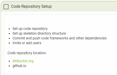
If you choose to use a code repo, expect it to take about one hour to set up, including the time it will take you to tell the rest of your team it is set up and document specifics in your documentation area. We recommend BitBucket or GitHub. If your team uses Slack, like ours, then linking the repo to Slack can prove to be a godsend for your management efforts. I highly recommend this.
Then, once it’s connected, make certain your development team knows it’s there and has access. Once again, this doesn’t usually take more than an hour, total.
Setting Up WordPress
Ah! Here we are. Let us not forget that this scope of work is designed explicitly for WordPress websites. Now we’ve arrived at the section of the scope where we begin to set up WordPress, itself.
Exactly how long this takes, or what, exactly, is involved, depends entirely on you. Our process typically takes about an hour, but it could be as little as five minutes.
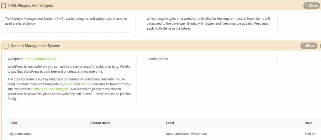
Adding in Plugins and Widgets
In the context of how this website SOW is set up, WordPress is your Content Management System, or CMS. Everything listed below that is a plugin or widget. These serve to flesh out the site and give added functionality
Contact Forms
A contact form add-on allows you to include a method for the visitors to the site to contact you and/or your client. Several of them can be used in conjunction, if you can find the right balance, to make for seamless integration. Our team has been using a combination of Gravity Forms and Ninja Forms recently.
Our WordPress website scope of work template, however, defaults to Contact Form 7. CF7 is a good default because it is entirely free. I’ve been using Ninja Forms, which has a freemium model, and paying for the expanded features. Until you know what you want, however, CF7 is a great place to start. There are, however, dozens of options for this particular plugin type. Feel free to explore and see what works best for you.
Contact Form Database
A contact form database is just what it sounds like. A database which your contact form feeds into. Contact Form DB is a plugin which works well with CF7 if you’re looking for easy, free synergy for this aspect of the site.
Security

One word: Wordfence.
It is a paid security plugin that was specifically designed to support WordPress sites. It is something that I include on everything that I do in WordPress now. The security is nice to have, and Wordfence is a reliable source of it.
ProTip: If you’re using WP Engine as your host, you don’t want to install Wordfence. They have their own backend security software and last I checked, they don’t allow Wordfence on sites they host as it messes with their systems.
Miscellaneous Plugins
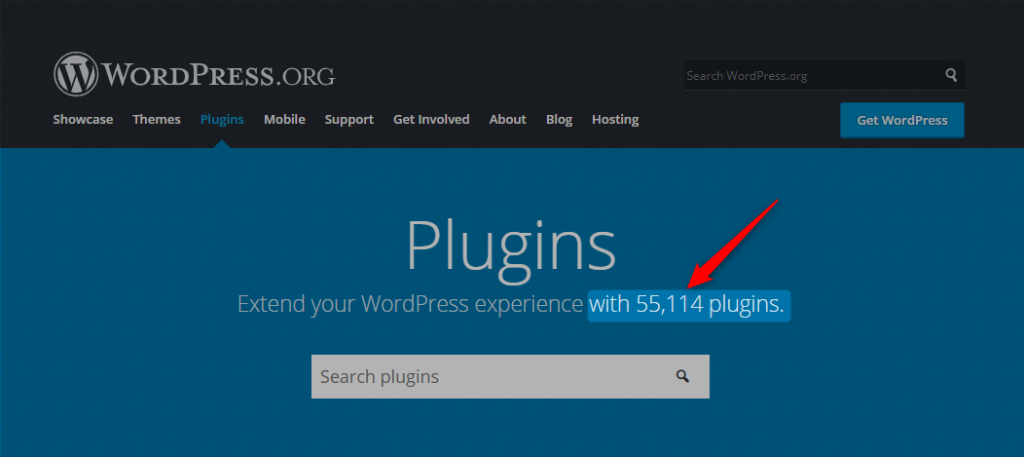
There are innumerable 55,114 as of April 21st 2019 different plugins for WordPress, and whatever needs you think you may have, there almost certainly exists a plugin to solve the problem, and likely with three or more competitors to boot. Here are a few more that I would recommend:
- Yoast: If you want a plugin to help with your SEO efforts, you can’t go wrong with Yoast. We use the free version, and it’s enough. There is also a paid version, and Yoast definitely has competitors, so feel free to look around. Yoast is included in the template because we believe SEO is so vital to what we do.
- Disqus: If building a community and allowing comments is a goal, then Disqus is likely the best commenting system plugin you’re going to find.
- Enhanced Media Library: EML is a good plugin to use for your images and documents if the site is meant to include a ‘Documents’ section.
Website Concept Design
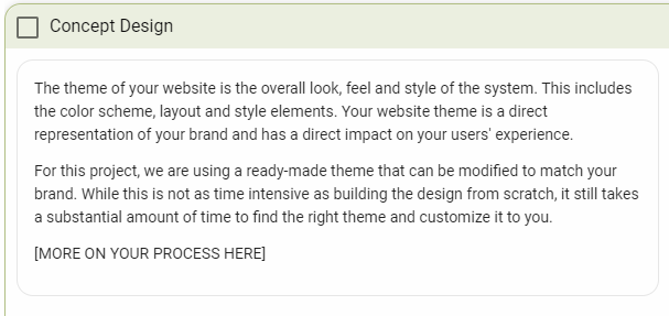
The next item on the list is concept design. It is important to point out that we’re constructing the scope in a linear fashion, but the way the project will be run is much less…simple. The ‘Concept Design’ task includes talking to the client — many times over. None of these conversations have to be regarding a singular topic. You may begin discussing concept design on the same calls in which you’re discussing the website’s information architecture.
If you’re using a theme…
This set of communication tasks reliably takes about ten hours time IF YOU’RE USING A THEME. Depending on the client, of course, this could vary tremendously, but ten hours is a good estimate. Of course, this website SOW is also meant for simpler sites. There are a lot of extremely good pre-built themes which can be purchased and customized in a very short time-frame — you’ll note that the ‘Systems Setup’ item is billed at just three hours.

If you’re building your own theme, it’s a different story
If your client wants a totally custom, from-the-ground-up theme, it could take tens or hundreds of hours to complete that work.
If you’re interested in seeing how a custom theme could change the scope of work, we’ll be going over that separately at a later date.
Back to using a theme
The rest of this set of tasks, if you’re using a pre-built theme, is straightforward:
- You need to have a discussion with the client about what they’re looking for, run ideas by them, etc.
- It is helpful to create mood boards and other conceptual items to run by your client for more detailed input.
- Once you know exactly what your client is looking for, you’ll need to research a variety of themes and select a handful to present to them, along with notes about how each can be modified to meet their preferences.
Don’t Forget Project Management Costs in Your Website Scope of Work
Somebody has to keep all of the gears turning.
If you’re the one doing research on how to build a website a scope of work – or for any type of project – then chances are good that you’re going to be trying to keep everything and everybody on task.
Question: Do you like getting paid for that work?
If you answered ‘yes’, then this part is very important to you, personally.
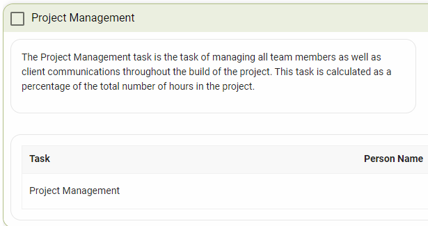
You have to ensure that your scope of work includes room for management. This is an element of any endeavor, in any industry, which is absolutely essential. Good management can help to streamline a task and make it more efficient, and good management deserves compensation for the money that they ultimately help to save.

Within this template, the default Project Management task to 20%. That’s an extra 20% of all project hours, not just a hard hour-count, added onto the bill at the end. This number can be changed, as you wish. We’ve found that the additional time spent on management-related tasks comes to about an additional fifth of the rest of the project, reliably. Though this can trend higher on larger projects.
Use your judgment. Just make certain that you get paid what you’re owed.
Don’t leave project management time out of your website scope of work!
Scoping Out Where Content Fits In Your Website SOW
SUPER MEGA ULTRA IMPORTANT PROTIP!!! If you are NOT doing SEO and/or content for your client, be sure to add a section into your website scope of work that says that you are NOT doing this. Stating what you are not doing, especially if you have discussed it with your client at some point before starting the project can save your butt and your pocketbook.
There are two major aspects here regarding content. This example website scope of work largely disregards these tasks, putting the onus of that work back onto the client to provide, leaving us with just the build.
However, that does not mean that we never work on content or SEO, as it depends on the agreements reached individually with each client. If you’re considering doing content work on your projects, there is nothing wrong with that, so long as you make the proper allowances in your scope of work.
At my agency, we almost always do the content as part of a the website build contract and SEO as a separate contract. SEO is usually a part of an ongoing marketing project with a minimum engagement of 3 months, where as the website project is a build that has a set start and end. So they work better as two separate contracts.
Search Engine Optimization
SEO is difficult, but there are a few tried-and-true tricks to it. So long as you’re smart and diligent, you can make it work and get your site ranking for the keywords that you want. This can provide a massive boost in organic traffic, which can turn into a lot of extra revenue for the client.
You’ll likely need to work alongside the client to help them figure out (or let them help you figure out) the best keywords to target. These keywords will need to be utilized in the content on the site, itself. But make certain that you’re ensuring that the keywords used on each page are tailored to that page and the questions that potential customers would be searching to need that page, specifically. Otherwise, a high bounce rate could negatively impact your efforts.
Pro-Tip: If the client is using a brand new domain, then make certain to advise them that it will take a little longer than normal to begin ranking. Even with an existing domain, it could take a minimum of three months. With a new domain, with no existing domain authority, it could take a minimum of six months to begin ranking. The client may wish to utilize PPC Ads to give their SEO efforts a boost in the meantime
Content Creation
Content creation is two-fold. There’s the raw content on the site, itself, which is the text that describes the items or services or the team on the various pages of the site. Then there’s the additional content, such as blog articles.
Both types of content are important to SEO efforts. Generally, the content and SEO come out better if we handle it. We have developed a lot of in-house expertise, of course. However, that is also largely up to the client’s preferences, so the default is that we’re not handling content, and it’s their responsibility to get it all written out and handed over to us.
And there are instances where this works out perfectly:
- When the client has an in-house writer
- When the client already has a lot of back-logged content they can import
- When the client’s niche is super-specific so they can only really use content from a small set of specialists or experts in that niche
Ultimately, feel free to ask the client about it, but don’t pressure them. If they seem comfortable with handling content, don’t push. But don’t let them backpedal later without revisiting the scope and discussing how the changes would impact the cost.
Include Pre-Flight QA Checks In Your Website Scope of Work
The next big section of the website scope of work is the Pre-Launch Checklist. There are several items here, but all of these tasks combined are metered at less than six hours. And they’re essential to the success of the project.
Quality Assurance (QA)
The first task, “Check All Pages Built Against Architecture”, is to make certain you’re actually done. If you haven’t actually completed everything that you said you would do, then you can’t launch, can you?
This comes first because it is basic and it is easy. And it doesn’t take long. It’s in the scope for one hour, but it honestly will likely take a lot less time than that for a small website – maybe five or ten minutes, tops, if everything is there. Potentially longer if your internet is slow or you’re working on a larger website.

Because, ultimately, all this involves is running through the list of each page that was supposed to be built, making certain that it’s there and that it works. If you want to be thorough, you can also double-check to ensure the many links work and that nothing has been missed on that front.
As flippant as we may sound about this step, it is important to do this correctly. The bigger the project is, the more time this is going to need. We’ve had government projects with hundreds of pages. So, certainly, a little commercial client with just 10-20 pages can be checked over inside of five minutes. But some bigger clients may need several hours.
The absolute last thing you want is to deliver a product and have your client come back and ask about an entire missing section. This is why it’s defaulted to an hour despite it often being a five-minute task.
Mobile Responsive Platform Improvements
The importance of mobile responsiveness to a WordPress website cannot be overstated.
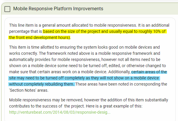
This task is the actual work of ensuring that the site looks and functions great on mobile. The amount of work and time this takes can vary, and this variance again relies on the complexity of the project and the theme used.
The best method of constructing an accurate estimate for this step, that we have found, is to expect to allocate roughly ten percent of the time spent on the site’s front end, as the yellow highlighted section in the image shows. We’ve defaulted this to five hours in this scope, which is considerably more than the ten percent mark (it is important to recall that it can go over that ten percent significantly on some projects).
The site will need to be streamlined for mobile users. As the blue section states, this will likely involve removing or turning off certain sections or tools because they won’t work on the platform without being rebuilt from scratch for the mobile platform
Then, again, there is the theme to consider. The better the theme is in initial quality, typically the less work this needs for mobile responsiveness improvements. So this five-hour placeholder could easily be one hour or less. Completely custom, from-scratch themes, of course, will take the longest to get this right, potentially dozens of hours
Mobile Responsiveness
A lot of companies forget this next thing:
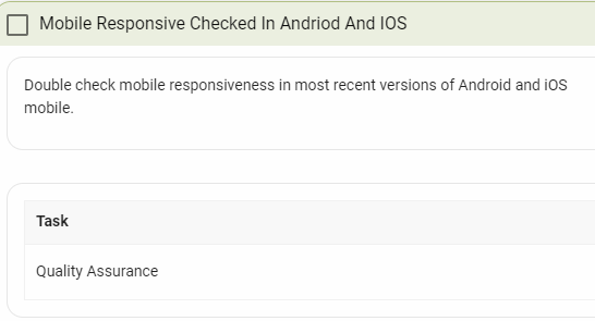
And this is actually fairly easy. The scope of work template defaults this to one hour, and it likely won’t take that. But it’s another very important thing to check. Mobile accessibility is becoming increasingly critical for digital marketing: more people are doing searches on their phones and, in recognition of this, Google has begun to include mobile responsiveness in their ranking algorithm.
All we do for this is run a check of the domain in BrowserStack. The tool reports back to us which operating systems or browsers (which includes both mobile and desktop platforms), or combinations thereof, may have issues with the site. Then we check those combinations manually and make any last-minute tweaks that are needed.
Part of why this takes so little time is because our developers tend to check this throughout the build process. So by the time this pre-launch phase comes around, it’s just a courtesy final check that the Project Manager has to run to ensure that everything is set and ready
Cross-Browser Compatibility
This is related to the above check, of course, but specifically focused on the desktop/laptop platform. This just requires a manual check on the most recent versions of the four major browsers:
- Mozilla Firefox
- Google Chrome
- Microsoft Edge
- Apple Safari
This is set for two hours, but will likely take much less time than that. Especially since BrowserStack can help with the heavy lifting.
Miscellaneous Tools and Additions
These last few checks are fast and simple, including a few additions to the site or simple tools to use.
Speed Check
Speed checks are simple and take next to no time. Just use a speedchecker tool.
Google Webmaster Tools
Ensure you add accessibility to Google Webmaster Tools tools. They offer a variety of testing and diagnostic capabilities to help your client’s long-term success. The Google Search Console can also help with figuring out what is and isn’t working for the client’s SEO efforts.
Sitemap
A sitemap helps search engine crawlers to break down and index your site more efficiently. A properly indexed site ranks more easily on searches.
Google Analytics
Google Analytics will be crucial in helping your client figure out how their advertising and social media efforts are working and how they might improve.
Robots.txt
Robots! They’re coming for your…

Well, they’re coming to index your site. Bots are plentiful on the web. Because of this, the robots.txt standard is already a quarter-century old. Malware bots, of course, will ignore the directives supplied in a site’s robots.txt file, but others will read and obey
Others such as Google’s or Bing’s crawlers. Yes. Crawlers are bots, too.
So if your robots.txt file isn’t set up correctly, your site won’t be searchable. This could be horribly embarrassing for you if your client calls you a year or two after launch to inquire about why they just can’t seem to rank anything. It could also be horribly crippling for them.
Make certain you go into your tools and check the box to make the site searchable.
SEO Checks
This final SEO check checks load times, network resilience, security, discoverability, and accessibility. This check, in particular, is an automated QA to ensure none of your links are broken. Search engine crawlers utilize links heavily, so broken links can impact your rankings

Blast Off!
After your pre-launch checklist is complete, all that’s left is to launch the site…and then check everything again!
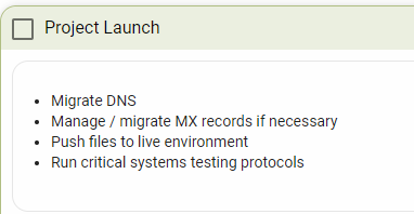
You’ll need to migrate your DNS for certain. You may also need to migrate MX records, but you’ll at least need to review them. Then, of course, you flip the switch and push the site live. All of this should take less than two hours.
At this point, it’s considered courteous to give the client a call and let them know that the site is live and that you’re monitoring it. Of course, you probably scheduled this for a specific day, so they’re waiting on that call.
After the call, though, you have a little more still to do.
Run Critical Systems Testing Protocols
This is the point where you go back through and make certain the new site is firing on all cylinders. This is also very, very tricky to include an accurate estimate for in a WordPress website scope of work. Every project is different, thanks to the flexibility of WordPress, so the exact list of things you need to spend time reviewing here will vary from project to project. For a smaller, basic site like the one this scope was meant for, though, one hour is a good default.
Nailing Down the Website’s Information Architecture
Information architecture is exactly what it sounds like: the way that the information on your site is structured. Smart IA design can make a site more accessible to its users and intuitive, which means users are more likely to use the site and its features.
Information Architecture begins with the Header and Footer
Header
A site’s header, of course, is the bit that lies at the top of the page. Anybody who has experience with browsing the web has been conditioned to look through the header first if they’re looking for something specific. It’s right there at the top of the page – the first thing you see. This is why most headers present a set of categories or types of information. And why if a site is going to have a search bar, it is typically right there.
We all know this from our experience, but that doesn’t mean that your client will know what the header is when it comes up. You’ll need to give them a quick reminder, such as the above paragraph does, in many cases. It truly is one of those things that most people know without knowing that they know.
However, it will still be up to you to advocate for the best practices and ensure that the decisions lead into smart UX design (honestly, it would not be a bad idea to keep your UX designer handy – maybe not on the call because they’re expensive, but still).
Nevertheless, it falls to you to ensure that the client understands:
- What is a header?
- Why does the site need it?
- What does it do?
- Why should it always be the same?
- What is the UX implication?
All of these clarifications will need to be repeated for the footer. You have to ensure that the client understands how these elements play into the information architecture

The header should take about three hours to set up — at least for its most basic components. This includes:
- A logo
- A phone number
- The main site navigation elements (see below)
- A “Get a Consultation” button
- An “Email/Contact Us” button
This template is for a service business, which is why we have a consultation button. Granted, a products-based business might want something similar, such as a link to a YouTube page showing off the products if, for example, the client sells software (wink wink).
And if the client is a local/brick-and-mortar business, they might prefer to include a physical address along with the phone number or a “Find A Location” button instead of the email button.
Flexibility is key. Make certain that the decisions make sense for what the client needs.
Pro-Tip: Many header elements can also be moved into a side-bar, but this can lead to some more challenging UX Design. Meaning more time required. Meaning a higher cost. And you’ll still need some sort of bare-bones header, at the least. So when writing out the architecture, don’t specify where things should be located, let the designers do that. Just say what should be there and how it should work.
Main Navigation Elements
Your Main Navigational Elements are your road signs and painted lines directing traffic to the information they need. These are typically visible in the header as section titles, such as “Home” or “Products”, and often many of these turn into drop-downs with sub-categories when moused-over.

For a service-based client, your navigation options will typically look something like:
- Home
- Services
- Our Work
- Company/About Us
- Staff/Meet Our Team
- Contact Us
The exact options can change based, again, on the client’s needs and branding, but these are good, generic options to include. And you will, of course, need to plan content for all of the pages that these options link to.
The Consultation Button
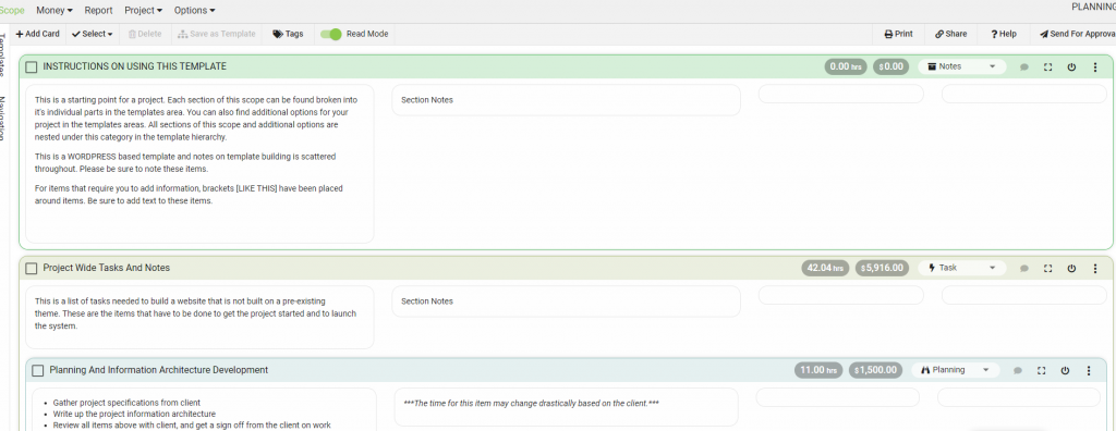
You may have noticed on the above screenshot of the scope of work that there was a discrepancy in the hour count. It was mentioned that it would take three hours, approximately, to set up the header, but the hour count shows as 4.75 at the top of the task.
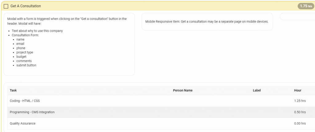
That’s because it’s going to take a little extra effort, that extra 1.75 hours’ worth of effort, typically, to code the ‘Get a Consultation’ modal. The button will need to pull up a form, which has to be built.
The form should include the following fields, at minimum:
- Name
- Phone
- Project Type
- Budget
- Comments
It should also have one final blurb about why the potential customer should use this service right above the form. And, of course, there needs to be a ‘Submit’ button
Footer
Once again, you’ll need to ensure that your client knows the purpose of a footer, but it is typically much simpler than the header.
In fact, if the theme you’re using is of good initial quality, then you may not need too much – or any – coding. It really depends on what the starting point is and what the final design calls for. But there are still some basic requirements for content which you need to meet:
- Contact info
- Full site navigation
- Copyright information
- Social Media links
The most difficult aspect, of course, is the sitemap, and that’s really just getting all of the links inserted with proper spacing and ensuring that nothing is missed. Tedium, rather than difficulty
The Home Page
The home page is the website’s first impression. Here, more than anywhere else, the website’s Information Architecture and User Experience design need to be flawless.

Much of that is controlled, of course, in the Header and Footer, which are still part of the total experience for the user.
But there’s always more that you can do.
I like to have goals for every page of a site, but the home page needs to stand out. If your home page isn’t making a good impression, then your chances (or, your client’s chances) of closing a sale will dip dramatically. Especially if your competition has a site which looks more professional, sleek, and generally makes a better impression with first-time visitors.
So, for the home page, we need to clearly and competently drive users toward the Call To Action (CTA) button. In the process, we need to inform the users of their choices and make it clear that by clicking this CTA, they’re going to find the support they need.
Your exact goals for each page will differ from client to client, of course, but the importance of a solid CTA, supported by ample and persuasive evidence will never change
The Promotional Image Rotator

Image rotators, also known as carousels or sliders, have become common tools with many sites now. You and your clients are going to be familiar with them. They’re fairly easy to do (because most developers are thoroughly familiar with them) and they typically help to provide a professional glean to a site.
The questions for you, your team, and your client, become:
- Does this tool provide the right message in the right way to system users?
- If yes, what is the messaging and how will we deliver this message?
- If yes, what will be the Call To Action (CTA) and where will it take the user?
This is a business decision the client needs to make and your design team needs to deliver on. Before you finalize this website scope of work and start working on the site, you’re going to need to confirm a hard number of images to include with the client. You also need to ensure both your team and the client understand why they are going to be using that many images.
PROTIP: Remember, in website design, design follows content. This means that your design is built to convey the content to the end user and thus you must have your content first. If you design a page first, without content, then you are creating a shell for the content to be entered into. This doesn’t work. When you do this, you inevitably will need to redesign the page or cut the impact of the message.
For the sake of simplicity, ensure that the client understands that they’ll need to number any images they send you, as well. Failing to do so, especially in larger sets of images, could lead to hard-to-catch duplications and the rotator will take longer for your developers to complete.
You’ll likely want to ensure that any promotions are included in the carousel. Including text on the images is standard, of course, because you’re trying to hit the user with efficiently-delivered information. An image with no text on the carousel is a missed opportunity unless the information is already there in some noticeable value, even if it’s just to show that your team has personality – that does carry value for users who are trying to figure out who to trust with their problems.
Lastly, you should consider ensuring that a Call To Action button is included every three to six slides. Having a CTA in the carousel is another opportunity for the user to click through
Company Tag Line
Most companies have a tag line or slogan, and that could be included on the home page somewhere, preferably near the top. If the company has no tag line or slogan, they might consider constructing a short sentence explaining who they are or what they do.
This isn’t mandatory, though. And if they don’t want it, you can take it off. It’s set as a simple, fifteen-minute task that just requires going into WordPress’ back end and plugging it in. That’s what the ‘CMS Integration’ is.
We have this added to the template unless it is requested, but it is often removed from the website scope of work.
Service Item Promotional Boxes
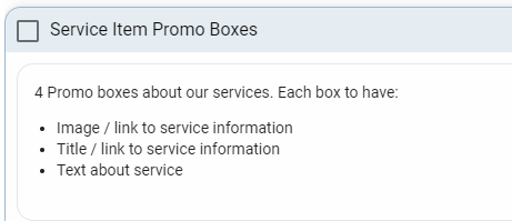
This is another fifteen-minute task.
These ‘promo boxes’ are just links out to the different services the company provides, so they’re just providing additional accessibility for users looking for specific types of services.
The rest of the home page
Now that you have a skeleton to start with, it is a lot easier to add new items and think through how things could be. So don’t be afraid of adding to the home page, taking things away, or just starting over. While many sites are very similar, very, very few are identical and those that are have some serious issues.
Services Page
The Services page is a page dedicated to…
You guessed it!
The different services that the company offers. Some companies will only have one, of course, but typically only the young ones. Most try to find multiple avenues of expertise which can translate to multiple avenues of revenue.
For a site the size we’re looking at, this page can just be a list or a table, if necessary. Nothing fancy. But this is something which, again, can depend on your theme. Your theme may make it easy to go a little farther, add a little more flash.

There are a few things that each service entry needs to have, of course:
- Service Name
- Image (optional)
- A link to the service profile page (see below; can be on title, image, or both)
- A short paragraph explaining the service; should be enticing to those who would need the service.
The services section, overall, might take approximately twelve hours to complete. And this will vary depending on how many services your client has. Only four of those hours will be spent on this page, specifically
Service Profile Pages
The rest of the allotted time for the Services section will be spent on sub-pages which detail each service, individually. This should include a description of the service and a breakdown of the benefits to the users who subscribe to that specific service, including why your client is better-positioned than their competition to render this specific service, more effectively.

For this task and its parent task, most of the time will be spent on:
- The HTML/CSS coding to adapt the theme to create the page-specific templates
- The content entry and formatting
Both of these are heavy on making certain that the page looks good. So make certain that your developers focus on that first. Remember that the visual appeal is a major factor in convincing users to click on a CTA button (and you need at least one CTA on each page)
The ‘Our Work’ Page
The next item in our WordPress website scope of work is the ‘Our Work’ page. This typically includes things like the company portfolio, maybe some statistics, links to case studies showing how the company has helped their clients, and any charitable work the company does.
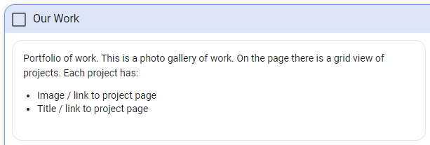
Just like the ‘Services’ section, this page will have sub-pages which take up the majority of the work in this area, which should total approximately fourteen hours, with the main page taking maybe one-and-a-half of those.
That’s because the main ‘Our Work’ page is just a hub with links going out to the others. Our basic setup for this is a grid of images which link out to the sub-pages. There isn’t much detailed content on this first page, itself. Maybe a paragraph or two overview.
The template for the page, as a grid, can often be found in the theme you purchased, as it’s a basic sort of template that is often reused. If not, you could potentially adapt the template that was used or created for the ‘Services’ page to minimize the work needed. Either way, keep in mind that you may need to add a few hours here to account for any work needed on the coding, as it’s not included by default.
Project Pages

The ‘Project’ pages in your website SOW are subordinate pages in the ‘Our Work’ section. These will be linked to from the ‘Our Work’ hub, similarly to how the Service Profile pages were accessible from the ‘Services’ section hub. Likewise, each individual project page will detail a specific project or project type.
This means that, just like the ‘Services’ section, the exact time required will vary somewhat based on how many individual pages you need to do. But the bulk of the effort will be on creating a template for the section, so the time for additional pages will be minimal, as it only requires plugging in the page-specific content.

Each page in this section should have:
- Text Information
- Title of Project
- Date Completed
- A description/case study
- Problems the client had and how they were solved
- The process used to solve the problems
- A photo gallery of the project
- This is just a grid view of the images
- When selected, the image will appear in a lightbox
- Lightbox
- Presents selected image in larger view
- Title
- Next/Previous buttons
- Close button
- User will also be able to click on the page, away from the lightbox, to close the lightbox
Company Page
The ‘Company’ page should be fairly straightforward. For some projects, this will be simple enough that all you need is a WYSIWYG editor. Some will also have a Staff listing, which could also be on a sub-page. So, from project-to-project, this could range between 1.5 to about a dozen hours. The default website scope of work we’re looking at estimates about 9-10, assuming that the staff list will be on the same page with individual staff profiles in either a lightbox or on their own pages.
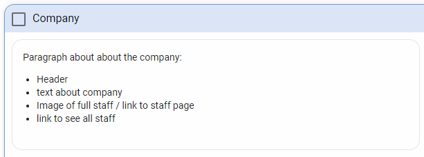
The base page will always include a header and a description or narrative of who and what the company is. This can include how the company was founded, what its aims and defining principles are, etc.
Then, you have the Staff listing. There are many ways to do this, and it depends on what the client wants. You could insert a full team image which then leads to a Staff page, do a list of Staff with or without images which lead to staff profiles, or anywhere in-between. There are also plugins on WordPress for staff listings, which work great and could make things easier for your team and cheaper for the client.
This is just another of those elements that will depend on what the client is looking for, so keep communication channels open and get this figured out before work begins so that you can provide accurate estimations on the scope of work
Contact Us Page
Next up in the scope of work is the contact page. This is where you give users a place to contact the client. And the nice thing about it is that pretty much every professional theme, nowadays, has a contact page template included. Because of that fact, this task shouldn’t take much time. It will take, at minimum, thirty minutes. But note that it never takes less than that. A half-hour is guaranteed.
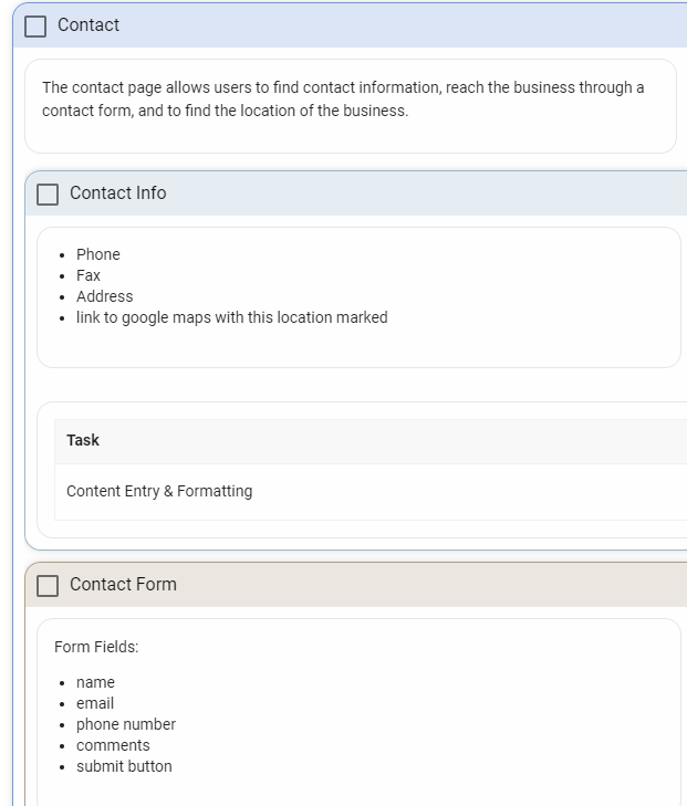
The contact page will need to include a few key details. These include the company’s basic contact information, such as phone, fax, and address. There is no need for an email address — the contact form makes that irrelevant. We’ve already discussed the contact form because it’s typically a plugin
Google Maps Location
If your client has a physical location they want to show off, that will also be on this contact page. Setting this up requires going into the Google Maps API through Google Cloud Services. It takes at least forty-five minutes, so make certain you leave time in the website SOW for that (or, don’t remove the time we’ve allotted in this template).
Social Media Icons
The final item in our WordPress business website scope of work template is adding in the social media icons on the contact page.
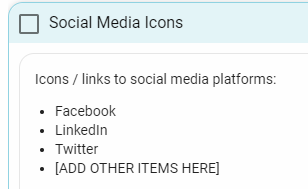
These aren’t ‘share’ buttons, but little icons that link to your client’s social media pages. The Facebook ‘f’ to their Facebook page, etc. This is entered as a fifteen-minute task. It really takes next to no time at all.
And That’s How to Build a (basic)Website Scope of Work
Of course, feel free to use our template. This one comes out to about 104 hours. It’s important to note just how much time goes into this project – because this was, again, just a small, bare-bones build; and just two or three more features could have doubled the time it took to complete. A lot of people assume that building a WordPress site will take a fraction of the effort that it actually does.
However, when you actually break it down, it takes a good two-and-a-half or three weeks of work. And the estimations may not be perfect. As we showed, there are things that will trend higher or lower depending on the project’s details, but this is a good average.
It’s also important to understand that expecting to split a 104-hour project between three people does not mean that the project can be finished in one week. There is a big difference between work time and project time.
The most important thing to take away from this is to make certain that you do not undercut yourself. Make certain your estimates are reasonable and that you’re billing a reasonable amount for those hours.
Unless you missed it at the top of the page. Get the WordPress Business Website Scope of Work Template here!
Download
Once again, feel free to outright steal anything you see here – this is a great scope of work template to use, and we hope that it proves as useful to you as it does to us when we need to start up a small business WordPress website.

